
BRAND IDENTITY
EVENT TECH
celedom
Bringing Culture to Celebration
celedom
.overview
Celedom is an event-tech platform built for culturally specific celebration — the Nigerian proposal in New York, the grandmother's recipe at a birthday in London. The brief was to design an identity for a platform that understands celebration as a cultural act, not a transaction; trusted like a platform, felt like home.
.the problem
Celebration is not universal. The way a Nigerian family marks a proposal is not the way an American family does — the food, the music, the feeling of home embedded in every detail are not interchangeable. Celedom was born from the founder's own experience of that gap: a Nigerian in the U.S. planning a proposal he wanted to feel crafted the Nigerian way, and finding no platform that understood the need. Every existing solution treated celebration as logistics. The brief was to build an identity for a platform that understands celebration as a cultural act, not a transaction.
.research
The first step was mapping the competitive landscape. Four platforms dominated the event planning and vendor marketplace space: Eventbrite, Evently, Zola, and GigSalad.
What they shared visually was more revealing than what distinguished them. Their brand languages communicated utility and exclusivity — clean, expensive, transactional.
| Platform | Visual Language | Gap |
|---|---|---|
| Eventbrite | Scale-first, utility-driven | No cultural warmth |
| Zola | Premium, aspirational | Weddings only, exclusive |
| GigSalad | Directory, professional | No emotional connection |
| Evently | Efficiency-focused | Treats events as logistics |
None of them spoke to the person who wanted their grandmother's recipe at a birthday in London. None of them acknowledged that for many people — especially those living away from home — celebration is an act of identity preservation.
.the whitespace
Not a gap in features. A gap in feeling. The entire category had optimized for the transaction and abandoned the emotion. Celedom's visual identity needed to own that abandoned territory.
.strategy
.core tension
Celedom needed to be trusted like a platform and felt like home.
Trust required signaling reliability, modernity, and digital-first thinking. Home required warmth, energy, and cultural resonance. Most brands in this space chose one or the other. Premium platforms chose trust and lost warmth. Community platforms chose warmth and lost credibility. Celedom needed both simultaneously.
Brand Type: Disruptive — entering a category defined by transactional utility and redefining it around human and cultural connection.
| Brand Personality | Strategic Function |
|---|---|
| Friendly & Approachable | Addresses first-time users unfamiliar with platform-based event planning |
| Innovative & Smart | Signals tech-forward platform credibility to vendors |
| Reliable & Trustworthy | Addresses vendor trust in the platform |
| Vibrant & Exciting | Carries the cultural energy the category was missing |
| Efficient & Organized | Reassures both celebrants and vendors on execution |
.design decisions
01
Color
The obvious choice was warmth — reds, oranges, yellows. Every competitor who leaned into celebration had gone there. The research said something different. Celedom was a tech platform first. Warm tones had become visual noise within the celebration space.
- Electric Blue #1B6BFE — Primary. Trust, innovation, boldness, reliability. Differentiates Celedom from every warm-toned competitor while signaling tech infrastructure credibility.
- Coral #FF6B6B — Secondary. Enthusiasm, passion, emotional connection. Carries the human warmth that Electric Blue does not communicate alone.
- Golden Yellow #FFC107 — Secondary. Festivity, togetherness, community, celebration. The cultural register of the palette.
The palette resolved the core brand tension: Blue carried the trust. Coral and Golden Yellow carried the culture.
02
Typography
- Gendy — Headline font. Modern sans geometric display typeface. Industrial design principles and clean letterforms reinforce Celedom's innovative, tech-forward positioning.
- Liber Grotesque v2 — Body font. Softer geometric structure balances Gendy's assertiveness and maintains readability across the platform's diverse use cases.
The pairing resolved the same tension as the color palette: authority and approachability in one system.
.logo directions
Three directions were explored and tested against the brief's core requirements: communicate celebration, achieve cross-touchpoint recognition, and reach across generational audiences.
direction 01 — rejected
Raised Glass
Why it was considered: the raised glass is a globally understood celebration gesture with immediate cultural familiarity.
Why it was rejected: symbol contamination. The raised glass appears on shipping and packaging internationally as a warning for fragile contents. In a digital platform context requiring immediate and unambiguous communication of celebration, a symbol that can simultaneously read as 'handle with care' introduces interpretive noise the brand cannot afford. It also appears in contexts of mourning toasts, religious ritual, everyday dining, and public health communication around alcohol — each activating a different emotional register, none of which serves a celebration platform.
direction 02 — rejected
Balloon
Why it was considered: balloons are widely associated with parties and festivity, with strong visual recognizability.
Why it was rejected: scalability failure. At app icon dimensions — 16px, 32px, and 64px — the balloon's recognizable silhouette collapsed into an ambiguous circular shape indistinguishable from dozens of other app icons. This is a critical failure for a digital-first platform where the app icon is frequently the first and most repeated encounter a user has with the brand. Balloons also carry too broad a range of non-celebration associations: medical balloons, weather balloons, hot air balloons, balloon animals, speech bubbles in comics. The symbol cannot claim ownership of celebration.
direction 03 — selected
Confetti Emoji
Confetti occupies a unique position in contemporary visual culture. It functions as a universal trigger for celebration reactions across digital communication platforms — and this recognition is not generationally narrow. Gen Z, Millennials, and older generations all share fluency with this symbol because of its embedded presence in digital communication habits across all three groups.
More importantly: confetti exists only in the context of celebration. Unlike a glass, a balloon, or a cake, confetti has no function outside of marking a moment of joy. It is the only symbol tested that is completely owned by celebration as a concept — mapping precisely onto Celedom's positioning as a platform that honors the emotional territory of celebration, not just the logistics.
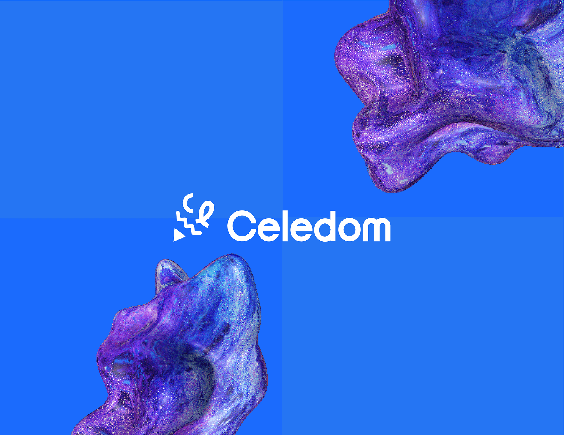
Within the mark, the letters C and E were embedded subtly, derived from the first two letters of Celedom. Human-centered geometry in the construction reinforced the platform's positioning as a connector of people, not services.
.verification
Tested against a library of over one million icons. Zero similar icons found. Legibility score: 100. Overall brand mark score: 90.
.system under pressure
A brand identity is not proven in the presentation. It is proven when the system is asked to do things the designer did not plan for.
Stress points tested across the Celedom system:
- Logo functioning as a 16px app icon and large-format building signage simultaneously.
- Color system holding legibility across both light and dark interfaces.
- Typography serving marketing headlines and functional UI copy without losing character.
- Pattern system built from the logo mark at varying scales and rotations — giving the brand flexible texture for packaging, digital surfaces, and print without requiring new design decisions each time.
- Iconography library extending the brand language into functional UI territory, maintaining consistency between the marketing identity and the product experience.
.reflection
Two things stand out in hindsight.
The competitive audit identified a clear emotional gap but stopped at visual observation. A more rigorous research phase would have included user interviews with people who had planned culturally specific events in foreign cities. Their language — the specific words they used to describe what was missing — would have sharpened the brand voice beyond the personality descriptors used. The founder's story was rich enough to suggest an entire user research thread that was never pulled.
The logo decision arrived quickly and the client approved immediately. That speed was a function of experience and pattern recognition, not a shortcut. But the process would have been stronger with documented alternative directions formally presented to the client, creating shared understanding of why the chosen direction was strategically superior rather than just visually preferred.
.what it confirmed
The most underserved space in brand design is not the gap between good and great execution. It is the gap between what a brand looks like and what a brand means to the person who needs it most. Celedom's visual identity works because it was built from a human story, not a market category.