
BRAND IDENTITY
MOBILITY TECH
rydaro
Building the Digital Road Captain
rydaro
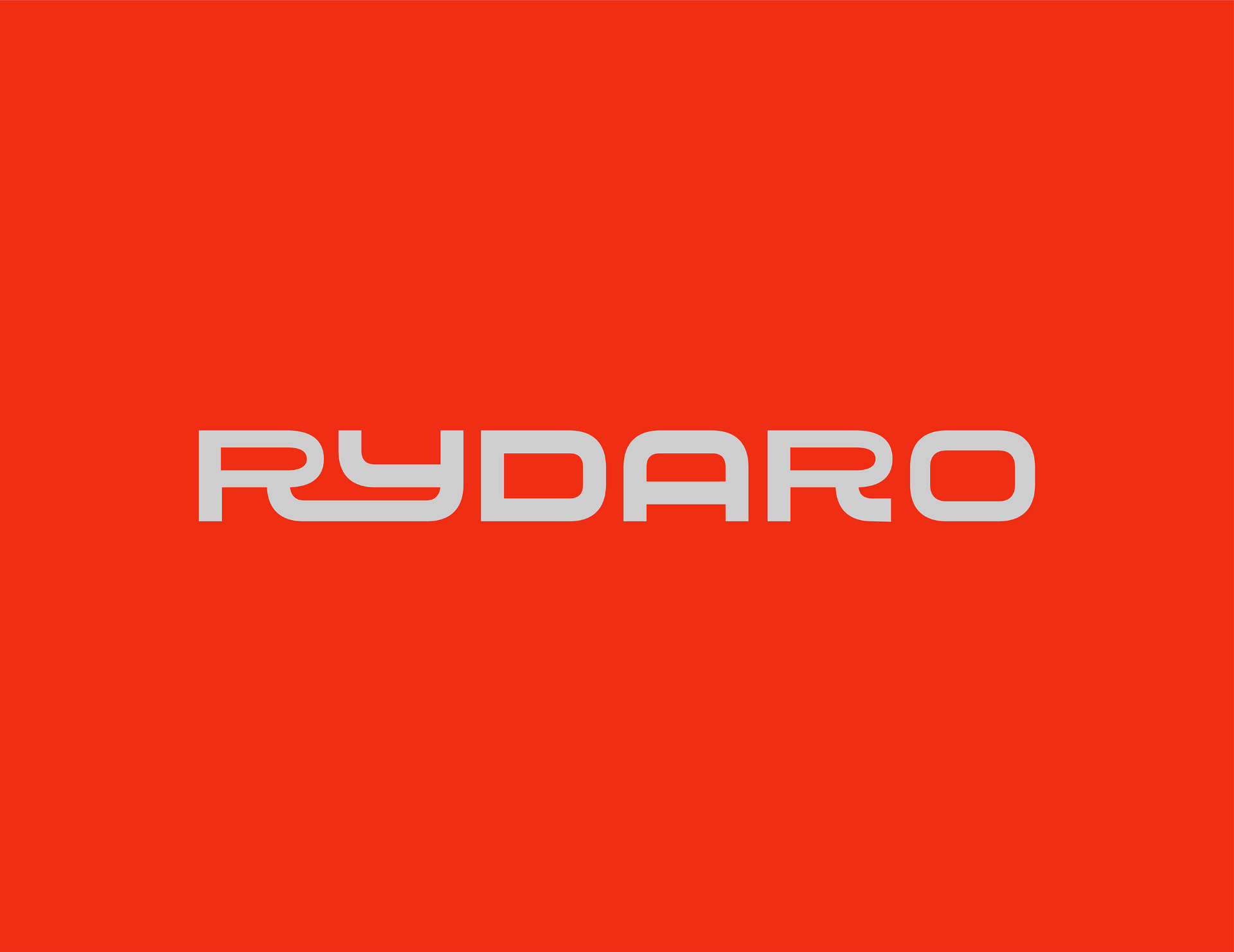
.overview
Rydaro is a digital platform built for the power bike community — social connection, route planning, clan management, ride analytics, and real-time coordination in one space. The founder asked for a logo. What the product needed was a complete brand system. That gap became the project.
.the problem
The power bike community is one of the most culture-driven spaces in modern mobility — riders share identity, not just roads. The founder, a senior backend engineer and active rider, was building a platform to hold all of it, and came with a single request: a logo. A platform serving a tight, culture-driven community could not survive on a single mark.
.the problem
The power bike community is one of the most culture-driven spaces in modern mobility. Riders do not just share roads. They share identity. Formation, coordination, brotherhood, the unspoken language of the ride — these things matter deeply to this community.
The founder, a senior backend engineer and active power bike rider, was building a platform to hold all of it. Social connection, route planning, clan formation management, ride analytics, real-time coordination. One digital space for everything the riding community needed.
He came with a single request: a logo.
.the brief
Design a logo mark for a digital platform being built for the power bike community.
What the product actually needed was a complete brand system. That gap became the project.
.research
The research phase was led by Elizabeth David, Brand Design Strategist and Lead Founder of Goshen Media. The findings mapped two core cultural territories the brand had to occupy simultaneously.
The first was raw riding culture. Brotherhood, speed, grit, the open road, the weight of community formed through shared physical experience.
The second was precision technology. Navigation systems, AI coordination, data-driven analytics, the clean logic of a platform built by an engineer who understood what bikers actually needed.
Most visual identities in the mobility and riding space lean entirely into one or the other. Platforms that lean into culture often sacrifice the credibility signals that attract tech-forward users. Platforms that lean into technology often feel sterile to communities built on lived experience.
.the filter
Rydaro had to hold both without collapsing into either. That tension became the design filter for every visual decision that followed.
.strategy
The product was pre-launch. The founder needed a mark he could carry into development, into community building, and eventually into market. The identity had to work as a logo today and as a full brand system the moment the platform shipped.
The decision to expand the scope beyond a logo was not discussed with the client upfront. It was made as a creative and strategic judgment call. A platform serving a tight, culture-driven community cannot survive on a single mark. Every screen, every touchpoint, every piece of community content needed to speak the same visual language. Without that foundation established before development, the product would ship inconsistent and the brand would fracture the moment real users encountered it.
.the constraint
The scope expanded. The timeline stayed at two weeks.
.design decisions
01
Color
Velocity Orange #F02E14 was selected as the primary color. The instinct in the riding space is to reach for black, chrome, or aggressive dark palettes. That choice would have buried Rydaro inside a visual category it needed to stand above.
Velocity Orange carries heat, urgency, and immediate presence. It commands attention on both dark and light surfaces — which matters critically for a mobile application used outdoors in variable lighting conditions. It signals energy without signaling aggression. It reads as modern without abandoning the raw energy that defines riding culture.
Asphalt Dark and Steel Gray were selected to ground the palette. These tones carry the technical, data-driven register the platform required. They give the system enough visual weight to feel like infrastructure, not decoration.
Neon Lime #39FF14 was held as a controlled accent. Used sparingly, it injects the raw cultural energy of biker aesthetics without compromising the precision the brand needed to project.
| Color | Role | Function |
|---|---|---|
| Velocity Orange #F02E14 | Primary | Brand presence, energy, recognition |
| Asphalt Dark #0D0D0D | Foundation | Technical depth, dark interface support |
| Steel Gray #6B7280 | Support | Data-driven precision, UI neutrality |
| Neon Lime #39FF14 | Accent | Cultural energy, selective emphasis |
| Minimal Lotion #F4F4F4 | Light | Clean backgrounds, print applications |
02
Logo
The logomark needed to communicate three things simultaneously: the letter R as brand identifier, direction as a metaphor for navigation and forward movement, and connection as the platform's core promise to its community.
The form was developed from research findings that pointed to angular, directional geometry as the visual language most resonant with both riding culture and navigation systems. The letter R was constructed with sharp angles that suggest motion. Embedded within its negative space is a chevron-inspired geometry — a directional arrow referencing the pathway of the road — that visually communicates coordination and forward navigation without requiring text to explain it.
The bold, solid construction conveys confidence and leadership. The mark reads as authoritative at large scale and retains its character down to 32x32px, the minimum recommended application size verified through accessibility testing.
Three logo configurations were established to give the brand flexibility across every context the platform would encounter:
- Primary Logo — Horizontal lockup of logomark and wordmark. The default configuration for most brand touchpoints.
- Secondary Logo — Wordmark only. For space-constrained applications: website headers, app navigation bars, email signatures, partnership contexts where the logomark would compete with other brand symbols.
- Brandmark — Logomark only. For app icons, favicons, loading screens, merchandise tags, and any context where the full logo would be illegible or impractical.
.clear space
Logo clear space was set at 79.59px on all sides — tied to the 8-point grid standard, rounding to 80px in practical application. Calculated clearance, not aesthetic preference.
03
Typography
Nunito Sans was selected as the primary typeface across all touchpoints — app, digital marketing, and print. The rounded terminals of Nunito Sans perform a specific function within this system. The logomark and wordmark carry sharp angles and geometric rigidity. Nunito Sans softens that without losing authority, creating visual balance across the full identity. Its weight range from Extralight to Black gives the system enough range to serve both marketing headlines and functional UI copy without requiring a second typeface for most applications.
Bitcount Prop Single was designated as the secondary display typeface, restricted to marketing visuals where cultural energy needs to break through the system's precision aesthetic. Its use is intentionally narrow. Overuse would dissolve the technical credibility the primary system establishes.
04
Pattern System
A geometric pattern framework was built directly from the logomark's core shapes. The intention was to give the brand a flexible surface texture that could extend across digital interfaces, merchandise, and print without repeating the logo itself.
Patterns built from logo geometry do two things a generic pattern cannot. They maintain visual coherence across applications the designer did not anticipate. And they make the brand feel like a system rather than a collection of assets.
05
Brand Play Assets
"Ride with Purpose" was established as the brand's primary expression line. It was developed to flex across merchandise, digital content, community communication, and marketing without losing its connection to the Rydaro identity. The phrase carries the dual register the brand occupies: the cultural weight of intentional riding and the platform's promise of precision and coordination.
The expression line was extended into sticker assets, apparel applications, and a horizontal banner format — each designed to function as community artifacts that bikers would actually want to carry and wear.
.system under pressure
The identity was tested across the contexts the platform would realistically encounter before and after launch.
| Test | What It Proved |
|---|---|
| App icon at 32x32px minimum | Brandmark retains core character below the threshold most complex marks collapse at |
| Dark and light surface contrast | Velocity Orange on Asphalt Dark holds visual impact and functional legibility for a dark-first UI |
| Grayscale, black, and white renderings | Mark holds form without color as a crutch |
| Deuteranomaly, Protanopia, Tritanopia | Recognizability holds across all three colorblind simulation types |
| Bottle, packaging, cap, bucket hat, notebook, hoodie | System held across every merchandise surface without special treatment |
.reflection
The client came in asking for a logo. The decision to deliver a brand system instead was made unilaterally, justified by the product's actual needs, and executed within the same two-week window the logo alone would have required.
That decision is the most important creative judgment call in this project.
A logo in isolation would have given the founder a mark he could place on a screen. What was delivered gives him a language his product can grow into. The color system can guide UI decisions. The typography hierarchy can inform content design. The pattern framework can extend the brand into community spaces the platform has not yet imagined. The expression line gives the community something to rally around before the product even ships.
The constraint that made this difficult was also what made it worth doing. Two weeks forces you to eliminate every decision that is not load-bearing. Every element in this system is there because it is doing specific work. Nothing is decorative.
.what it confirmed
The most valuable thing a brand designer can deliver is not a beautiful artifact. It is a decision framework that holds even when the designer is no longer in the room.