
BRAND IDENTITY
CREATIVE SERVICES
inventra
Bringing Fusion to Fragmentation
inventra
.overview
Inventra is a centralized multi-service brand execution partner — built to absorb the coordination overhead that fragments creative work across freelancers, agencies, and marketplaces. The identity had to embody the very methodology it promised clients: declutter, analyze, reorganize.
.the problem
A founder building a brand spends more time managing creatives than building their business — chasing a designer, briefing a marketer, coordinating a developer. Each provider in isolation, each requiring the vision re-explained, each producing outputs that don't speak to each other. Inventra was built to solve that human cost, not a market gap on a spreadsheet.
.the problem space
The problem was not abstract. It was witnessed.
A founder trying to build their brand was spending more time managing creatives than building their business. Following up with a social media manager. Chasing a designer. Coordinating a developer. Briefing a marketer. Each provider working in isolation, each requiring the same vision explained again from the beginning, each producing outputs that didn't speak to each other. The brand suffered not from lack of ideas but from the structural failure of how creative services were delivered.
.core observation
Strong ideas, capable businesses, and meaningful organizations often suffer from poor or inconsistent execution — not lack of vision.
This is what Inventra was built to solve. Not a market gap identified in a spreadsheet. A human cost observed directly. The fragmentation of creative services was stealing time, credibility, and momentum from businesses that deserved better.
The brief for Inventra's identity was therefore unusual in one critical way: the designer was also the co-founder. The visual identity needed to represent a design philosophy from the inside. The brand had to embody the very methodology it was promising to deliver to clients.
.research findings
The competitive landscape included independent freelancers, small creative agencies, and freelance marketplaces such as Fiverr and Upwork. What the audit revealed was not just a visual pattern but a structural one. Every competitor was selling access to talent. None were selling the elimination of the coordination problem.
| Competitor Type | What They Sell | What They Miss |
|---|---|---|
| Fiverr / Upwork | Access to talent | Strategy, continuity, accountability |
| Small Agencies | Bundled services | Project-by-project, no long-term partnership |
| Independent Freelancers | Individual skill | No cross-service consistency |
| Inventra | Elimination of coordination friction | Owns the whitespace entirely |
A second insight emerged from discovery calls. Clients would arrive believing they knew exactly what they wanted. The process consistently revealed something more complex — they had ideas but not clarity, vision but not language for it. The act of being asked the right questions, of having their thinking deconstructed and reorganized, was itself transformative.
.foundational insight
Fragmentation is not only an operational problem. It is a cognitive one. Clients didn't just need execution — they needed someone to help them see their own brand clearly before a single pixel was designed.
.strategic position
.core tension
Corporate-grade quality delivered with human accountability.
Corporate-grade meant the outputs needed to hold their own against what large agencies produce — the brand could not look scrappy or experimental. Human accountability meant the brand needed to feel like a partner, not a vendor. Not a platform, not a directory, not a faceless agency. A team that listened before it executed and remained available as the brand grew.
| Brand Personality | Strategic Function |
|---|---|
| Professional | Addresses the quality concern. Corporate clients need to trust that outputs meet their standards. |
| Reliable | Addresses the deadline and consistency concern that fragmented providers had failed to meet. |
| Considerate | Carries the human dimension. The discovery-first approach. Listening before acting. |
The brand type was defined as a centralized multi-service brand execution partner. This classification was deliberate. It rejected the agency label because agencies bill by project. It rejected the freelancer label because freelancers lack continuity. It created a new category positioning that no direct competitor occupied.
.design decisions
01
The Conceptual Framework
The pixel/bitmap concept did not arrive from aesthetic preference. It arrived from methodology. Clients would arrive in discovery calls with fragmented thinking — ideas that seemed disconnected, vague, or contradictory. The design process began not with sketching but with deconstruction. Breaking the client's thinking into its component parts. Analyzing each element separately. Then reorganizing those elements into a coherent system.
A bitmap image provided the precise analogy. Examined at close range, a bitmap resolves into a grid of discrete pixels — individual units with no apparent relationship to each other. Step back and those same pixels coalesce into a coherent image. The closer you look the more fragmented it appears. The broader your perspective the clearer it becomes.
.why this metaphor
The pixel/bitmap framework was not chosen because it looked interesting. It was chosen because it was an accurate description of how Inventra worked.
02
The Wordmark
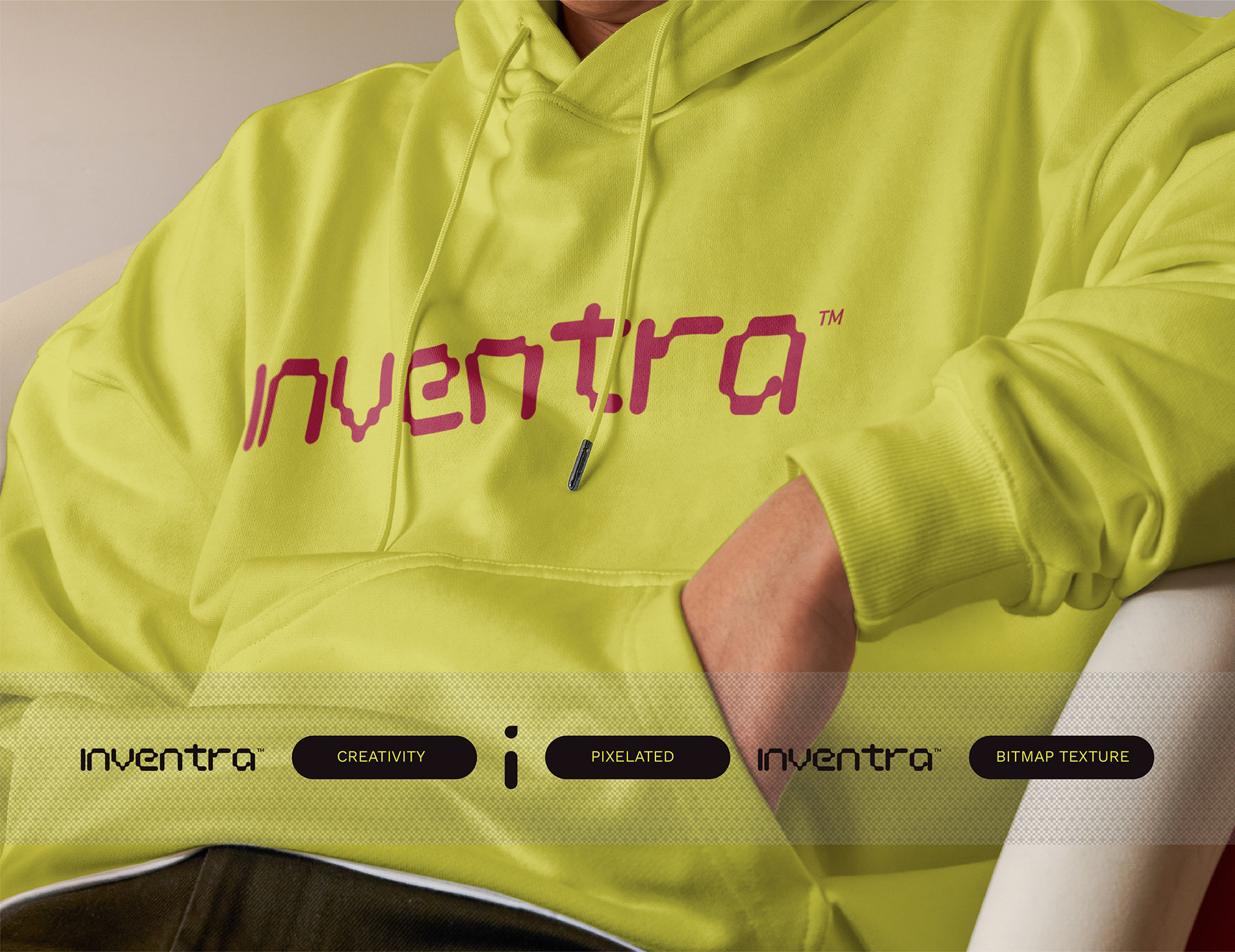
The Inventra wordmark was constructed using a round pixel art aesthetic, each letterform built on a modular grid system derived from the bitmap concept. Every letter was designed to demonstrate the principle it represented: discrete units, governed by a consistent underlying structure, that together form something legible and coherent. The grid construction was presented not as a technical exercise but as a philosophical statement — this is how we approach every client project. We find the grid beneath the complexity.
03
Color
- Acid Yellow #DCF763 — Primary. Confidence signal. Agencies and creative platforms tend toward safe neutral palettes. Inventra's yellow says: we are not trying to disappear into the background of your brand. We have our own identity. That confidence is evidence of our ability to build yours.
- Near-Black #170F11 — Primary. Grounds the energy of yellow without neutralizing it. Creates the visual authority needed to sit alongside corporate clients.
- Extended Palette — Supporting. Teal, crimson, orange, purple, pink. Gives the system range across touchpoints, allowing the brand to express warmth, energy, and variety without losing structural coherence.
04
Typography
Work Sans was selected as the primary typeface. Its geometric construction aligned with the grid-based philosophy of the visual system. Its range of weights from thin to black gave the brand the flexibility to communicate at every scale, from small print to large format signage, without requiring a secondary typeface for basic hierarchical needs.
.system under pressure
Inventra's identity was stress-tested across a broader range of touchpoints than most brand projects require. This was intentional. A company positioning itself as a multi-service brand execution partner needed to demonstrate that its own identity could hold across every service category it was promising to deliver for clients.
| Touchpoint | What It Proved |
|---|---|
| Business stationery & ID cards | Corporate credibility at professional scale |
| Apparel & merchandise | Cultural presence and brand world depth |
| Digital assets & social media | Platform consistency across formats |
| 3D rendered environments | Aspirational brand world building |
| Packaging | Tactile brand experience and system flexibility |
Across every context the pixel/bitmap texture functioned as a unifying thread. The dot-matrix pattern derived from the logo construction appeared on product surfaces, environmental graphics, and digital backgrounds without requiring new design decisions. The system generated its own extensions from a single conceptual principle.
.the proof
When the idea is right, the system scales without breaking.
.reflection
Designing Inventra from the inside created an advantage and a blind spot simultaneously.
The advantage was depth. As a co-founder, the brief was not handed to me — I lived it. The discovery call insight, the frustration with fragmented creative services, the vision of what a centralized brand partner should feel like, these were not research findings. They were operational realities. That proximity produced the pixel/bitmap methodology metaphor that a designer working from the outside might not have arrived at.
The blind spot was the same proximity. When you are inside the brand you are designing, it becomes difficult to see it as an outsider would. Inventra's identity was built primarily from internal observation and competitive audit. It was not tested against the target audience before launch. The founders who would eventually become clients were not interviewed during the design process. Their language — the specific words they used to describe the coordination frustration — was inferred rather than gathered.
A more rigorous process would have conducted structured interviews with five to ten founders in the target profile before the first sketch was made. Their vocabulary would have sharpened the brand voice and potentially surfaced insights that internal observation missed.
.what it confirmed
A brand system is not proven by how it looks in a presentation. It is proven by whether it can generate new applications from its own logic without requiring new design decisions. That is what a strong concept does — it does the work even when you are not in the room.